Chapter 4: Creating Your Campaign
You have a plan and you built a community. It’s time to create your campaign.
You’ve done a ton of work planning, strategizing and building a community of engaged and excited fans. This means it’s finally time to start building your campaign page. In this chapter, we will walk you through each part of the campaign creation process and share our best practices on how to make your page stand out. There is a lot to do during this part of your journey, so let’s dive into the major parts of the campaign creation process.
STEP ONE: TITLE & TAGLINE
Grab attention with a great title and tagline
Your title and tagline are the first things a backer will see on your campaign page and while browsing Indiegogo. Let’s make sure these two elements stand out and capture your audience’s attention.
Do:
Keep it simple and spark curiosity
Use relevant keywords to help people find you with search
Be clear and direct with your “ask”—your main call to action
Don’t:
Repeat the campaign title in the tag line
Use overly technical terms
Examples:
Luna: Bring the moon along with you
Transform your space into a magical world with this moon lantern. Comes in 7 sizes.
Help us raise back the $100,000 a donor asked us to return because we welcome transgender girls.
Keep Art in SF: Help Build the New Root Division
Help Root Division build a bigger, better, brighter new home for the arts in San Francisco!
STEP TWO: CAMPAIGN CARD IMAGE
Use an eye-catching “campaign card” image
If your campaign were a book, your main image—around here we call it the “campaign card” image—would be the glossy cover that grabs your audience. The campaign card is what shows up on Indiegogo’s homepage and category pages, so it’s a great opportunity to make a memorable first impression. Campaign card images perform best when they are high resolution, colorful and tell your story visually.
Do:
Use a close-up shot of one person or product that stands out
Use color
Show your product or idea in context
Don’t:
Use too much text
Zoom out too much
Include too many visual elements
Examples:

Wearable fitness tracking device Misfit Shine showed their product in use.

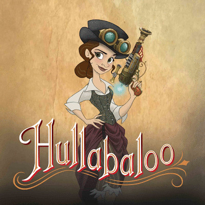
Steampunk animated film Hullabaloo focused on their title character.

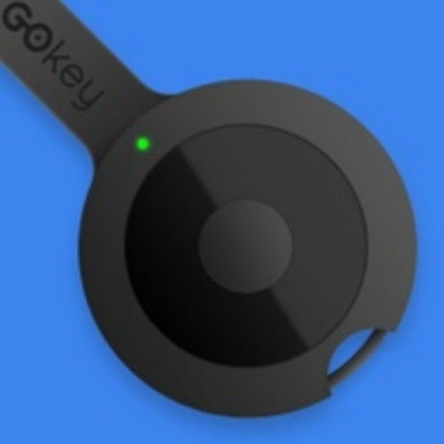
Portable charging technology GOkey’s image stands out with bright colors.
STEP THREE: FUNDING TYPE
Choose the funding type that fits your goals
Indiegogo offers two types of funding options: flexible and fixed. For many Indiegogo entrepreneurs, it’s possible to run a great campaign with either funding style. However, we’ve found that the most successful entrepreneurs take the time to match the funding style to their overall plan for marketing, perk fulfillment and manufacturing, if applicable. Below are some factors to consider as you make your own choice.
Flexible funding
Flexible funding lets you keep the funds you raise, even if you don’t hit 100% of your goal. For entrepreneurs that can fulfill their perks even with partial funds, flexible funding can be an excellent fit. We’ve also seen flexible funding work very well for entrepreneurs who have secured other sources of funding for their project. For example, if you’re planning a technology crowdfunding campaign and have already lined up extra funding to cover your perks, you might consider using a flexible funding campaign specifically to validate your idea and test the size of the potential market.
For many Indiegogo entrepreneurs, flexible funding offers the confidence of knowing that you can move forward even with a partially funded campaign. It’s important to remember though that flexibility and responsibility often go hand in hand, and it’s essential that you follow through both on your perks and your overall commitment to your backers.
Fixed funding
Fixed funding is all-or-nothing—if you hit or surpass your goal, you keep all that you earned; if you fall short of your goal, all funds are returned to your backers. Fixed funding can be useful when your project requires a strict minimum amount of funding to be successful, which is common for technology or design projects with substantial up-front manufacturing costs. While it’s possible to hit big goals with either funding style, fixed funding may help give your backers extra confidence by signalling that their funds will be returned if you don’t hit your target.
STEP FOUR: DEADLINE & SCHEDULE
Set a campaign deadline and schedule
Once your funding goal is decided, it’s time to turn your attention to another important number: the end date for your crowdfunding campaign. Take a step back and list out some of your basic milestones. By what date do you need funds disbursed? Are there manufacturing or delivery deadlines to consider? How much production time do you need? Have you factored in a buffer in case of delays? Lay out all of your milestones clearly and chronologically and be sure to sequence every step so you have ample time to fulfill all of your perks. And don’t forget: By sticking to a schedule you’ll give your backers more confidence in your project—and happy backers are often your best ambassadors.
Pro Tip: Opt into InDemand
For many Indiegogo entrepreneurs, a successful crowdfunding campaign is just the start. Seamlessly transition your campaign to Indiegogo InDemand, our program for ongoing fundraising, pre-orders and audience engagement. With Indiegogo, fundraise as long as you like!
Do:
Give yourself ample time—60 days of prep is often a good place to start
Plan to run your campaign for 30-45 days
Factor in time for funding disbursements (typically 15 days)
Leverage holidays and seasonal trends to add extra momentum to your campaign
Don’t:
Set goals or deadlines that put you at risk of not fulfilling your perks
Don’t underestimate how long it might take to package and ship perks
STEP FIVE: PITCH VIDEO
Craft a compelling and shareable pitch video
A pitch video is one of the most powerful ways to tell your story. In fact, our research has shown that campaigns with a pitch video raise 4X more than campaigns without a pitch video. Your video can show your idea in action—whether it’s an introduction to your product or a preview of your film. Video gives you the chance to speak directly to your audience and inspire them through music, movement and human connection. Part of the power of the pitch video is shareability. Just ask the Solar Roadways team. Their “Solar Freakin’ Roadways” video, created by fan Michael Naphan, helped their campaign quadruple the amount raised in a matter of days.
The “Solar Freakin’ Roadways” video was a viral hit, capturing over 21 million views.
What’s the format?
Keep it short. Your backers are busy people, so give them the best aspects of your story in the smallest amount of time. As a general rule, aim for 2 to 3 minutes.
Introduction
Make the first 30 seconds count with a memorable one-sentence summary of your project.
Goals
Explain why you are raising funds. For creative projects: Are you raising funds for the materials, distribution or both? For technology products: Are you raising funds for manufacturing or pre-orders? Briefly explain your background, emphasizing the experience that makes you qualified for the project.
Showcase
Show examples of what your project is going to look like. For creative projects, show examples from past work; for technology or design projects, show examples of people using your product in action.
Call to action
Tell your audience how they can get involved in what you’re doing. Share at least one specific, actionable option.
Pro Tip: Combine text and images to grab attention on any device
Remember that the best content works well on any platform (from desktop to mobile) and in any viewing situation (whether at home or on the train to work). The “Solar Freakin’ Roadways” video immediately makes its point, even for viewers who might first see the clip on their phone, with no sound or narration.
Best practices for your pitch video
When sketching out your pitch video, keep the “two Ps” in mind: people and production. Showing human faces (especially your own!) helps your audience relate to your project and your goals. Similarly, establishing a high production quality will reassure your backers that you’re on the path to success.
Appear in your video
By introducing yourself you are creating a personal connection with your audience that can last well beyond the campaign.
Include testimonials
Including testimonials from third-party sources (community members, experts in the field, fans) is a great way for people to understand more about the impact of your project.
Sound quality matters
High-quality sound can have an enormous impact on how backers respond to your campaign. In some cases, the sound is more important to the pitch than the video!
Examples:
The team behind Jibo won over audiences by showing their friendly robot concept in a variety of relatable settings.
The Micro Drone 3.0 team brought backers behind the scenes in the development process by sharing early test flights.
STEP SIX: THE STORY
Use your campaign page to tell the world your story
Your campaign page is where it all comes together and where your audience joins your journey. A clear and compelling story told through text, video and images can make the difference between merely hitting your goal and far exceeding it. Since the average person spends only a few minutes on your page, optimize the top of your campaign page for the best results.
What’s the format?
While the campaign page offers a lot of flexibility for telling your story, there are seven key components to consider as you sketch out your narrative of text, images, links and more. Here’s what you need to know:
Hero image
Start your campaign with a colorful, high-resolution image (620px x 415px, at a minimum) that captures people’s curiosity. A great image has the power to communicate the essence of your campaign before your audience reads a single word.
Short summary
Include a brief summary at the top of your campaign page. Aim for three sentences or less and include what your project is, who’s behind it and why it’s important. Potential backers should have enough information from this summary to contribute right away.
Showcase
Give your backers a clear sense of what to expect from the completed project. If you’re developing a product, show photos of your invention in action. For creative projects, share your storyboards, concept art or prototypes. The clearer and more relatable the end result, the more likely you’ll attract enthusiastic backers.
Perks
Don’t forget to include images and descriptions for every available perk. Give your audience great reasons both to back your campaign and to share your story!
Team
Include photos of your team members and a sentence or two about their relevant background and experience. The team section helps build trust with backers who are just getting to know you.
Timeline & budget
Set clear expectations with your audience by including simple visuals that lay out your timeline, perks and goals.
FAQs
This is where backers can go to find specific details or logistics. Think of this section as a valuable investment—a good FAQ section might save you hours on customer support later in the process. FAQs usually work best at the bottom of your campaign story.
Pro Tip: Use infographics to simplify your messages
Infographics can be a handy way to quickly communicate complex information such as fulfillment schedules, perk levels and more. Not a designer? No problem! Piktochart is one of several online tools for quickly and easily creating graphics.
Best practices for your pitch story
Remember that most visitors will spend only seconds deciding whether to learn more or move on, so spend some extra time making sure your first impression is a great one.
A picture’s worth a thousand words
Break up large blocks of text with headers and photos. The less people have to read, the faster they will absorb the information on the page.
Keep the top of the page short
Keeping the top of your page short is important to capture the attention of visitors just landing on your page for the first time. Visitors who are more invested will dig down into the details, but most backers will only see the top of the page.
Share your achievements
If you have awards or press for your project, include them below the short summary at the top of your page.
STEP SEVEN: PERKS
Use perks to help draw your audience into the story
Well-planned (and smartly priced!) perks are at the core of any great campaign. They’re also one of your best tools for engaging and attracting an audience. The more enticing your perks, the more likely people will back your project and share your story.
What are the basic types of perks?
Perks can come in just about any imaginable shape or size, so get creative and your audience will likely reward you with enthusiasm and engagement. Below are some of the main categories to consider as you make your perk plan.
Digital
Digital downloads and access to exclusive online content are both great options, especially for media-related campaigns. Take the Super Troopers 2 campaign, for example. The campaign team offered a very affordable (and thus very attractive) $10 perk: a kit of behind-the-scenes goodies including set photos, the shooting script and handwritten jokes from the writing team.
Physical goods
For tech or design entrepreneurs, the first perk might be the very product at the heart of the campaign. Other physical perks might include tote bags, posters or other tangible objects that help backers show pride and join the fun. One great example comes from the Solar Roadways campaign, which offered pendant necklaces made from solar cells damaged during the assembly of their prototype.
Experiences
“Experience” perks might range from event tickets to a Skype session with the project team to opportunities for backers to get involved in the project, like visiting the set of a film production or participating in more extensive product research. For example, the Blue Oak Brewing Company capitalized on the excitement around the opening of their new brewery by offering a unique experience for beer lovers. A $500 perk gave backers the chance to visit the brewery and get a lesson on how to brew beer with professional-grade equipment.
Personal touches
A personal touch could be something handmade, like a drawing or a thank-you note, or something that is otherwise unique to you and your campaign. For her film project The Space Between, Amy Joe Johnson offered to draw an original artwork on canvas and write a personal song. The perk also included a unique thank-you letter and a digital download of the song.
Best practices for perks
The most popular perk level is $25-30, but campaigns earn the most funds from perks at around the $100 level. We recommend offering a perk at both levels to get the most from your campaign.
Start with less
A long list of perks can overwhelm first-time backers. Instead, start small then add new perks to build momentum. Consider adding a limited supply of perks with special early-bird pricing — it’s a great way to stir up excitement at the onset of your campaign.
Feature a perk
Use Indiegogo’s “featured perk” option to highlight a specific perk at the top of your page. We recommend featuring your most popular perk, which you can monitor in your Campaign Dashboard once you launch.
Pro Tip: Offer a “secret perk”
Use our secret perk feature to reach your most loyal supporters with unique offers. There are many ways to use secret perks, but the underlying idea is to create special offers and incentives for your most engaged backers.
FEATURED RESOURCE
Smooth out the planning process with our official prep calendar
Stay on track with our 120-day calendar and checklist
Expert guidance for every step, from pre-launch to post-funding
© 2016 Indiegogo, Inc. All Rights Reserved


